# Live Components
# Introduction
A live code component is an interactive and dynamic element in web development that allows real-time execution, editing, and visualization of code within a web page or application. These components are particularly useful for educational purposes, documentation, and interactive coding environments. Let me explain the concept in more detail:
Use Cases are:
- Interactive tutorials and learning platforms
- API documentation with live examples
- Code playgrounds for experimenting with languages or libraries
- Technical blog posts with editable code samples
- Coding interviews or assessments
- Collaborative coding environments
There are libraries like Sandpack (opens new window) and react-live (opens new window) that can help you add live coding components to your MDX. There are various ways to implement live code components. Here's a simple example using react-live (opens new window):
# Implementing Live Components with react-live
➜ nextra-casiano-rodriguez-leon-alu0100291865 git:(guide) cat components/live.jsx
import React from 'react';
import { LiveProvider, LiveEditor, LiveError, LivePreview } from 'react-live';

// See https://commerce.nearform.com/open-source/react-live/docs
const LiveCodeComponent = () => {
  const code = `
    function App() {
      const bS = { padding: '10px', fontSize: '16px', backgroundColor: 'lightgreen', border: 'none', borderRadius: '5px' };
      const hS = { fontSize: '24px', color: 'blue' };
      const [count, setCount] = React.useState(0);
      return (
        <div>
          <h1 style = {hS}>Count: {count}</h1>
          <button style={bS}
          onClick={() => setCount(count + 1)}>Increment</button>
        </div>
      );
    }
  `;

  return (
    <LiveProvider code={code}>
      <div className="grid grid-cols-2 gap-4">
        <div>
          <LiveEditor className="font-mono" />
          <LiveError />
        </div>
        <div style={{ flex: 1 }}>
          <LivePreview className="" />
        </div>
      </div>
    </LiveProvider>
  );
};

export default LiveCodeComponent;
2
3
4
5
6
7
8
9
10
11
12
13
14
15
16
17
18
19
20
21
22
23
24
25
26
27
28
29
30
31
32
33
34
35
36
The LiveProvider component is the top-level component that takes a code prop,
which contains the code to be edited and previewed.
It acts as a context provider for the other react-live components.
Inside the LiveProvider, there is a div with a CSS class of grid
grid-cols-2 gap-4, which sets up a two-column grid layout with a gap between the columns.
This layout is achieved using Tailwind CSS utility classes.
- The first column contains another
divthat houses theLiveEditorandLiveErrorcomponents.
- The
LiveEditorcomponent is where the user can edit the code. - The
LiveErrorcomponent displays any errors that occur in the code being edited.
- The second column contains a
divwith an inline style which allows it to take up the remaining space. Inside this div, there is theLivePreviewcomponent, which renders the output of the code being edited in real-time.
# Using the Live Component
Here is the mdx page that uses the live component:
➜ nextra-casiano-rodriguez-leon-alu0100291865 git:(guide) cat pages/live.mdx
import Live from "@/components/live"

# Live Components

<Live />
2
3
4
5
# Running the Live Component
It looks like this:
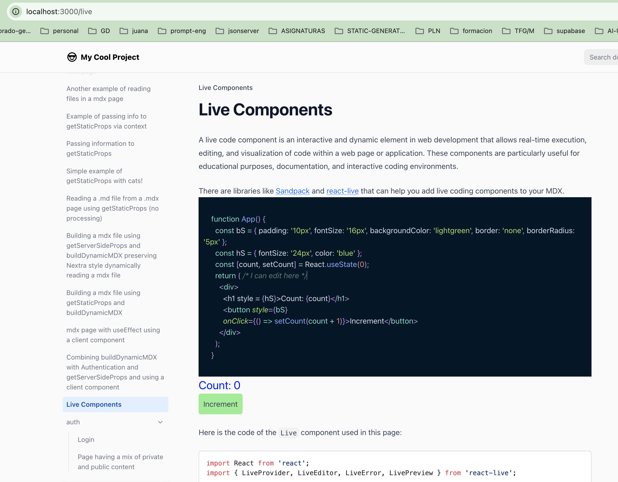
Now you can edit the code and lively run it seeing the results in real-time.